Charts and graphs are an important (and expected) component of a completed facility assessment. One reason for that is it’s easier for the human mind to understand large quantities of complex data if it’s organized into some sort of illustration or visual. It’s a concept known as data visualization.
And considering the sheer volume of information contained in an assessment, building owners and facility managers are depending on you (their assessment provider) to organize that data into something they can understand at a glance. Do that right and you’ll have happy clients. Get it wrong and you could lose business.
So let’s explore what you need to know about data visualization and how you can improve the ways you showcase assessment information.
What is Data Visualization?
Data visualization transforms raw data into meaningful and actionable insights. Say you want to explain how the world’s population is distributed. Instead of showing a column of numbers, you could create a colored map showing the various population densities of each country.
Both formats contain the same information and make the same point, but the map is easier to understand and more memorable. Why? Because a person can process visual stimuli much faster than text or numbers. Like the saying goes, “a picture is worth a thousand words.”
Common examples of data visualization include:
- Interactive dashboards
- Network graphs
- Heat maps
- Pie charts
- Pivot tables
- Scatter plots
- Side-by-side graphs
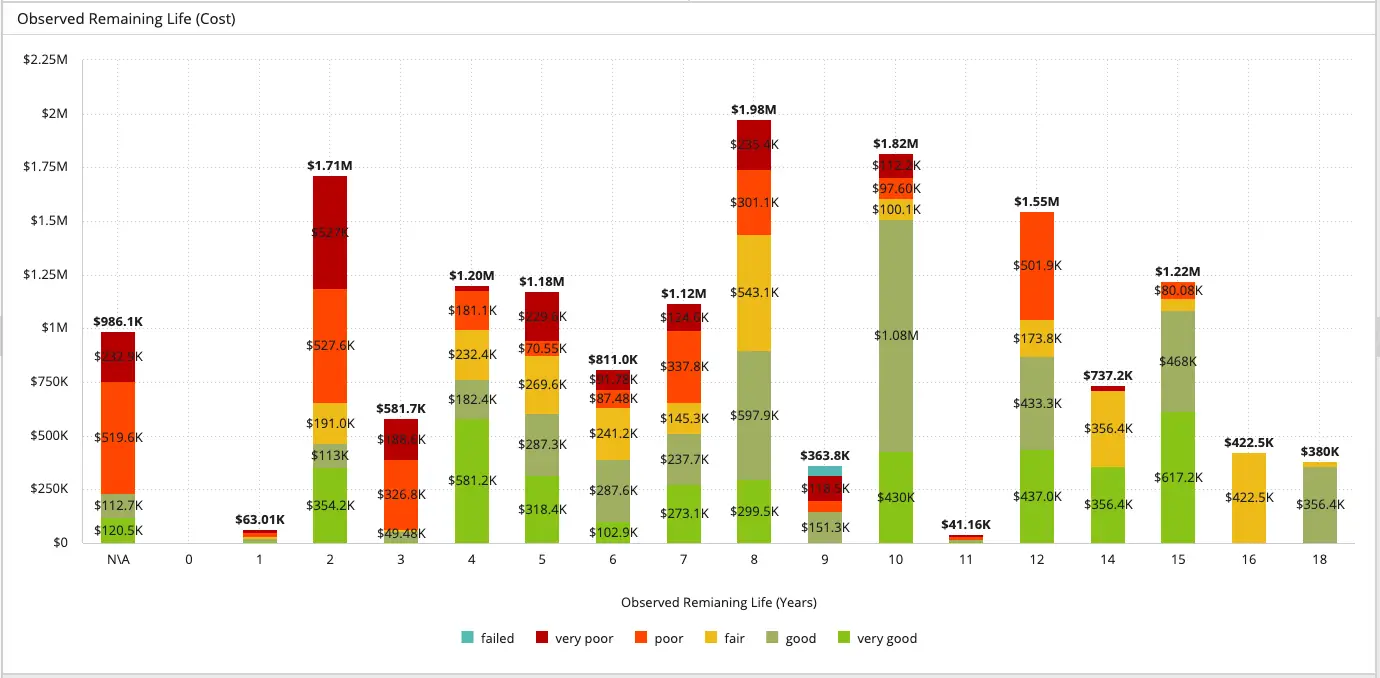
Image caption: A sample data visualization using AkitaBox software.
Why is Data Visualization Important for Facility Assessments?
In the context of a facility assessment, data visualization is all about presenting information about the current condition of a facility in a visual and intuitive manner so stakeholders can understand and interpret the data more easily.
These visualizations can take many forms depending on how your firm does assessments, including:
- Trend analysis: line charts or bar graphs showing how the condition of different assets has changed over months or years.
- Comparative analysis: side-by-side charts or stacked bar graphs comparing the condition ratings of similar facilities or highlighting variations between different building systems within a single facility.
- Color-coding: red indicating high-priority maintenance needs and green representing assets in good condition.
- Maps: facility condition indexes of multiple buildings or building groups displayed on a map.
- Filtering: data filters for drilling down into information about a specific building, system, or asset.
Data visualization serves several important purposes in a facility assessment.
Enhances Understanding: Facility assessments contain tons of complex data. Visualizations clearly and concisely present the data, allowing stakeholders to quickly identify trends, patterns, and areas of concern. They make the information easier to digest and provide a starting point for key discussions about maintenance priorities, budget allocations, and resource planning.
Identifies Priorities: By visually representing the condition of different assets or locations, stakeholders can more quickly spot where they need to focus their time and money, whether it’s urgent concerns that must be addressed right away or longer-term issues that need to be planned for.
Supports Smart Decision-Making: Visualizing data helps facility managers make informed decisions about their maintenance strategies, repairs, replacements, and capital investments. It’s easier to compare the condition of different assets or facilities, identify cost-effective solutions, and prioritize actions based on available resources and budgets.
Enables Easier Trend Analysis and Planning: Part of data visualization in assessments typically involves displaying historical data over time and highlighting important future items, such as the replacement dates of major assets or systems. Seeing this helps stakeholders understand how the condition of the facility is changing and plan ahead for future maintenance needs. By identifying patterns and trends, stakeholders can be more proactive about ensuring the facility’s ongoing performance and longevity.
Fosters Engagement: Data visualizations make it easier to get everyone on the same page regarding what’s happening in a facility. This shared understanding supports better collaboration among the various teams involved in or impacted by the assessment results.
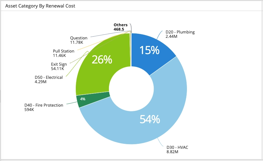
Image caption: A sample data visualization using AkitaBox software.
Tips for Better Data Visualization
You may have collected awesome data for an assessment. You may have some of the most experienced engineers in the industry reviewing that data and making excellent recommendations based on it.
But if the presentation of the data falls flat, is hard to understand, doesn’t make sense, or just plain looks ugly, your clients won’t be impressed – and they’ll struggle to see the takeaways the data is trying to tell them.
Don’t let that happen to you. These tips can help you create great data visualizations.
Ensure Data Accuracy and Integrity
Data integrity is THE most important aspect of data visualization. Before creating your visuals, triple check that the data you’re using is complete and accurate. This is especially important if the tool you use for data collection is separate from the one you use to build the charts and graphs. When you manually transfer data from one place to another, mistakes are more likely. It only takes one typo to mess up a visual.
Give Each Visualization One Main Message
Don’t try to convey too much in one graph. Each visual should have one key message or takeaway. For example, instead of showing the geographic spread of assets in poor condition AND the types of assets in poor condition in one chart, consider splitting them apart into separate visuals so they’re easier to understand. Cluttering your visualizations with too much data distracts from the main message.
Keep it Simple and Intuitive
Think clean, uncluttered, and minimalistic. Let the data be the star of the show – there’s no need for extra embellishments. Use clear and intuitive icons, labels, and legends to guide viewers through the visualization.
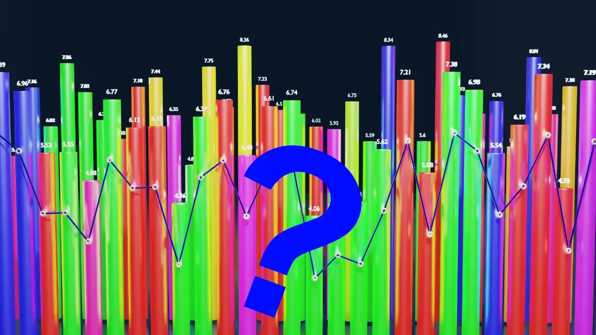
Image caption: An example of what not to do when creating data visualizations.
Use Color with Care
Color is a powerful thing. It enhances visual appeal and can make the data easier to understand. It’s often used to highlight important elements, create visual hierarchy, or group related data. BUT, don’t go overboard. Avoid using too many colors or colors that don’t make sense based on what you’re trying to convey.
Gather Feedback
Test your visualizations with representative users to collect feedback. Make adjustments to improve clarity, readability, and engagement. Even if you have templates for charts and graphs you’ve been using for years with no complaints, it’s a good idea to examine how you can update or improve your visuals. Regular testing and refinement ensures your visualizations are optimized for communication and decision-making.
This free data visualization checklist is a do-it-yourself way to see how good your visuals are.
And finally, one last tip: evaluate the program (or programs) you use to create your data visualizations. Your tool plays an important role in how professional your visuals look and how easily and accurately you can build them. When analyzing your visualization tool, ask yourself:
- Is it flexible enough? Do I have lots of options for showcasing data in different ways?
- Is it directly connected to my data? Or do I have to manually transfer assessment data into it?
- Do the visuals I can make look outdated?
- Is it powerful enough to handle all of the data it needs to?
- Is it easy to use, understand, and modify as needed? Or are my formulas and templates hard to build and easy to break?
If your current tool is holding you back from creating world-class data visualizations and assessment reports, it might be time for a change.
Software Designed for Assessment Data Visualization – and Much More
What if you could create data visuals for your next assessment without having to use extra software like Microsoft Excel? Now you can.
AkitaBox FCA software is one tool for all the stages of a facility assessment: data collection, cost estimation, data analysis and visualization, and report generation. The assessment data stays in one tool through the entire assessment process, seamlessly flowing from one stage to the next.
When it comes to the data analysis and visualization step of an assessment, it’s incredibly easy and fast to create clean, impactful visuals using the AkitaBox Insights reporting engine (a part of AkitaBox FCA software).
- Generate a wide variety of sleek visualizations
- Collect them all into customizable, interactive dashboards
- Every visualization is directly tied to the original assessment data collected onsite
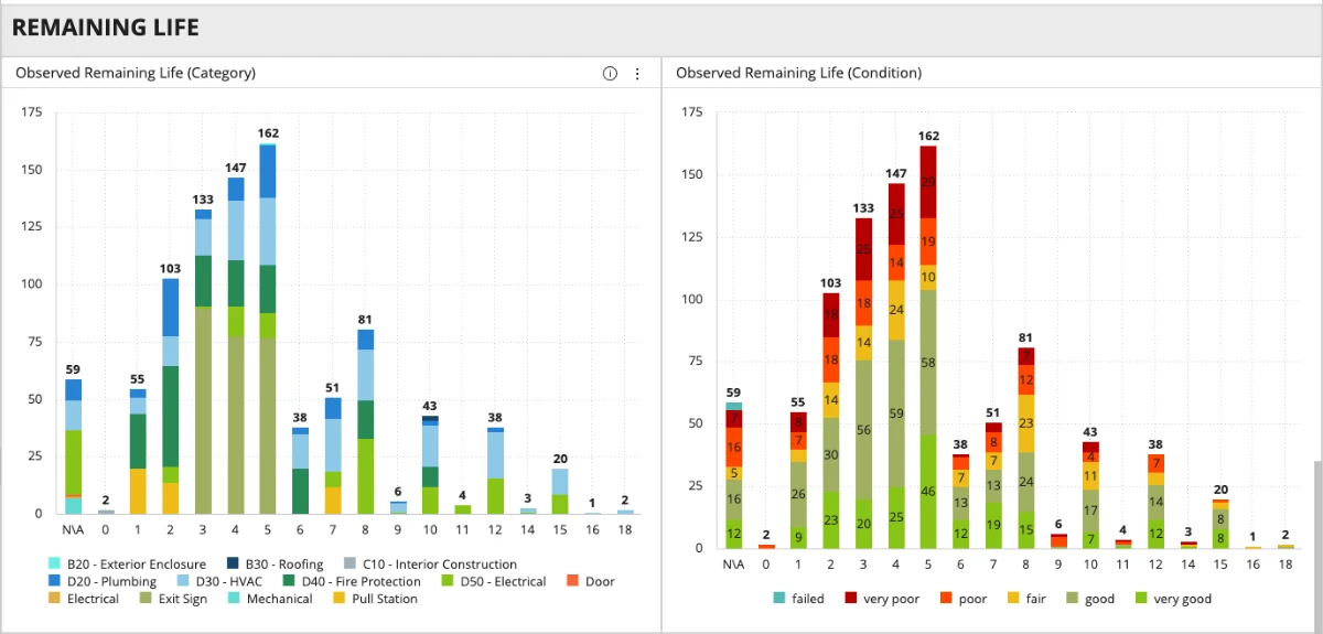
Image caption: A sample data visualization created using AkitaBox Insights.
Once you’ve completed the data analysis and built the appropriate visuals, it’s time to present them to the client in a final report. AkitaBox Report Builder (an integrated part of Akitabox FCA software) makes that part easy, too.
- Create custom report templates
- Insert data visualizations directly from AkitaBox Insights
- Pull in asset information and photos directly from the raw assessment data
- Drag and drop different sections to build a compelling document
- Download reports as PDFs
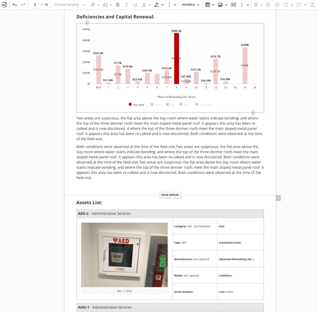
Image caption: A sample page from an assessment report created with AkitaBox Report Builder.
See what’s possible from the first and only end-to-end assessment software. Set up your free, customized demo today!
Data Visualization Resources
Data Visualization Checklist
Data Visualization Society
The Psychology Behind Data Visualization Techniques
The 30 Best Data Visualizations of 2023 [Examples]
Facility Assessment Resources
5 Tips for Smoother Facilities Data Collection
FCAs: A Path Forward for Contractors in a Tough Economy
5 Reasons Why AEC Firms Use AkitaBox FCA Software
FCA Resource Center for AEC Firms